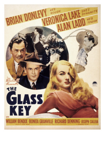
The Glass key (1942)
|
The female character, Jane, played by Veronica Lake, is a femme fatel character. This is show in the poster by the costume and makeup she is given and also by the expression on her face. For example, for a typical femme fatel character, she has been given red lips and dark coloured eyebrows which frame the face very well as these strong colours contrast with her fair skin tone. For her costume she is wearing a sleek red dress which makes her look elegant and sophisticated. The facial expression that Veronica lake has on the poster is a very snide smirk that makes her look cunning. The Poster hes three main factors which relate back to the plot of the story. Firstly veronica Lake who plays Janet, is overall an evil manipulative character, she falls inlove with the man she is engaged to but at the same time she is in love with her fiance's good friend. On top of that she is involved in a murder. This relates back to her being the centre of attention of attention on the poster and also it shows why she is being shown as an evil character Secondly The two other main characters are behind her which shows that she is more dominant over them as they are more foolish and gullible to believe her. The thirdly there is a key in the background which related back to the name of the movie and the story of it. The images for the poster mainly show the characters only and also a glass key. The use of colours on the poster range from beige to a rich red and then a small use of grey/black colours as the film is a film noir movie. Also the main focus of the poster are in colour and the intensity of the colour is quite strong. Where as behind the two men there are screen shots of other characters of the movie on dark, cold colours. The characters are the main focus of the story and the meaning/story behind the key in the movie links back to events in the movie.
|
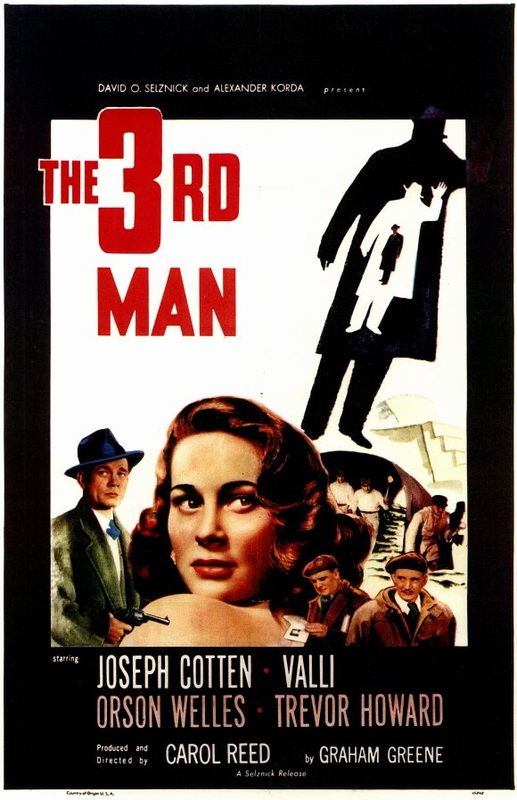
The Third Man (1949)
|
The female character, Anna Schmidt, played by Alida Valli. She resemble the look of a femme fatel charcter but she doesn't have the characteristics of a typical femme fatel character. This is shown on the poster by the rich red lips and wavy curly hair which resembles a femme fatel character and also by the way her facial expression makes her look vulnerable and suspicious. The images on the poster show you the characters of the story, one of them is Anna Schmidt and the other is a male character who looks like an investigator or police man. This assumption would be made because of the fedora hat that he is wearing on the poster. There are other characters below who have daring looks on their faces which makes them looks like they are crooks. Also next to the title of the movie there is an expanding outline of 3 men in it. This relates back to the title of the movie "The third man". The colours that were mainly used on the poster are black, white and red. The colours contrast with each other and stand out. The pictures and writing which need to stand out the most as they are the most informative, are the strongest colour on the poster so that it becomes the main focus of the poster. The idea of 'The 3rd Man' comes across in the poster through the pictures so you know that the idea of it is the main focus of the movie as well as the female character who has the largest portrait on the poster, which shows that she is the main focus of the film also.
|
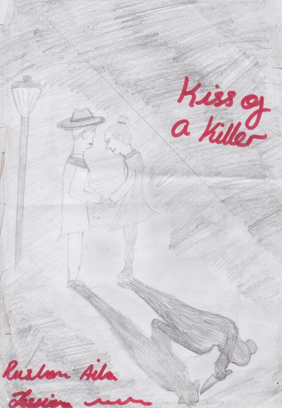
Hand Drawn Draft:
Original Photos


Final Film Noir Poster

Film Posters Representing Women
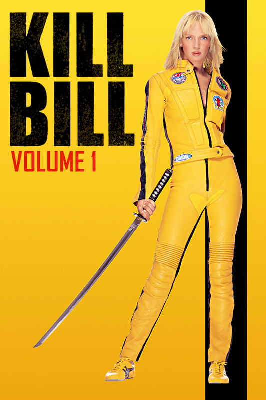
Kill Bill Vol. 1:
|
The genre of the movie 'Kill Bill: Vol.1' is a hybrid of Action and Thriller. The film poster only shows Uma Therma which shows the audience that her character has the leading role in the movie. Her role is evident to be of a high importance as she is the only character on the poster and also by the way she has been presented in the film poster also shows that her importance in the movie is high. You can directly see her and only her on the poster so she is ought to be the first thing that you will look at on the poster so you as an audience member are aware that the plot of the movie is based on her. Her costume she wears is a yellow leather outfit and also she is holding samurai sword. The costume she wears makes her come across as a dominant and tough character in the movie. This is evident for the audience because of the samurai sword that she is holding. Her posture is up right which makes her look powerful and the weapon she holds shows she is a fighter. The film poster represents Uma Therma's character as a strong, tough woman.
|
Lara Croft Tomb Raider:
|
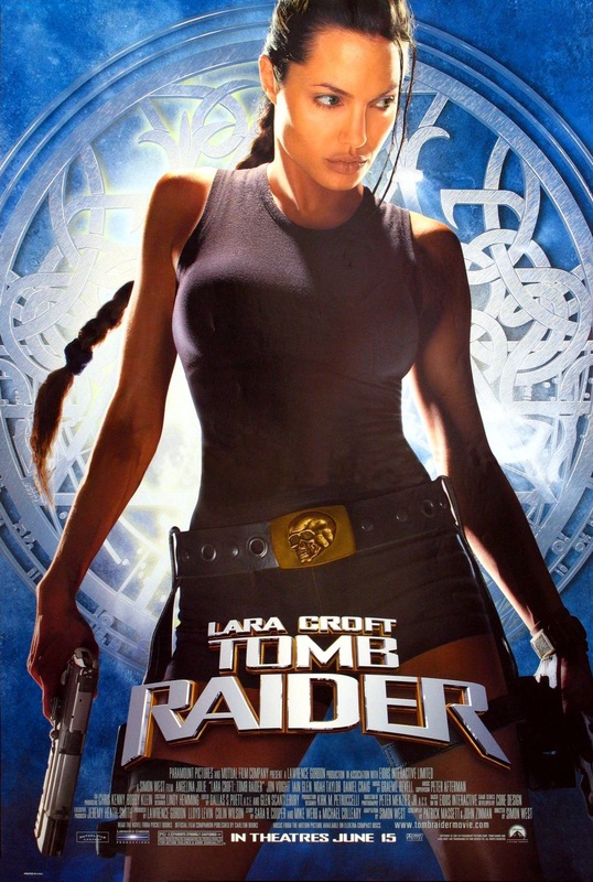
The genre of this movie is a hybrid of 'Action' and 'Fantasy'. The poster only shows Angelina Jolie which tells the audience that she is the main character of the movie. It is clear to see that her role in the movie is of a high importance as she is the only character seen on the poster and also because of the way that the poster is presenting her character. the costume that she is seen wearing a black sleeveless top with black shorts and a weapon belt around her waist. Her costume subverts the stereotype of women being shown as vulnerable and weak. As she is the first thing that you see on the poster, you as an audience member, know that the movie's plot is based on her. The poster represents women as strong and powerful by the serious expression on her face and the upright posture that she has.
|
Film Poster
Hand Drawn Draft:
Original Images Used:
Photoshop Draft Film Poster:
Film Poster Final:
Planning and Evaluative Commentary
For this project, the task was to create two film posters that represented a dominant female character. For the first film poster, i had to create a Film Noir poster presenting a femme fatale character. For the second film poster, I had to produce a Hollywood film poster which was a hybrid, presenting a dominant female character. For the Hollywood film poster, i chose to do a romance/thriller as a hybrid.
Warner Bros. is one of the oldest Film Institutions in the world and have previously produced various Film Noir movies such as 'Double Indemnity' in 1944. For my Film Noir film opening "Kiss Of A Killer" , for a previous project, I used Warner Bros. As the film institution. I was creating the film poster for "Kiss Of A Killer", so I decided to use Warner Bros. as the institution that would produce the movie of my film poster. My Film Noir movie's target audience were adults ranging at an age group of 20+ years. The reason of why i chose the target audience to be adults of that age range is because it would most likely appeal to them the most rather then for younger age groups. I know that adults would appeal to the stereotypical conventions of a film noir movie such as the mystery of the story and the presentation of a femme fatale character in a film noir movie.
For my Hollywood film poster "Vengeance", I again used Warner Bro's as the institution that would produce the film because Warner Bros. has produced movies in the past of a similar hybrid such as the "Final Destination" film series. The target audience for my Hollywood film was aimed at teenagers/young adults aged 15+. The reason of why I chose the target audience to be teenagers/young adults is because the female leading role is a teenager in high school so the audience would be able to understand and relate to the character in the movie. Also the film is a hybrid movie so as well as the genre being a thriller, it is also a romance movie and I know that this would appeal to female teenagers also.
Femme fatale characters were populated in film noir movies and this helped for the research for my film noir poster. I knew that the film noir poster had to relate to my film opening "Kiss Of A Killer" therefore I looked at noir movies of a similar storyline such as "Double Indemnity". By watching the movie and analysing the characteristics of the femme fatale character, I was able to use research from the movie to apply it to my film poster. Using typical conventions of a film noir movie such as back-streets and shadows, I was able to draft a film poster which suited the story line for my film opening.
For the Hollywood film poster, the research was much more difficult to do as I had to narrow down the sort of female character I wanted to present on my film poster and which genre the film would be. After looking at various movie posters which had a female leading role, I decided to choose a film of a thriller genre with a female teenager as the leading role. To make the film poster a hybrid I decided to add romance into the story. It was easy to put the female character in a situation that would involve romance and a situation that would match the thriller genre. Using conventions of a thriller story such as low light settings and blood, i was able to draft a Hollywood film poster.
My film noir poster's representation of women was evil. The blocking of the female character was very dominant to show that she was the stronger character. By putting her in front of the 'anti-hero' in the movie, it showed how her character was taking the lead of her relationship with the character but also showed that he would lead the movie. It was also her shadow on the ground which showed that her character was evil as it was pointing a gun at the male character (anti-hero); the aim of the shadow was to show the audience that her character was a backstabber and was an evil character as these were typical characteristics of a femme fatale character. The colours used for the poster were mainly black, white and red. The black and white is used as that is what the colour of film noir movies were. The red however was used as a representation of blood. The male character on the poster is seen wearing a trench coat and fedora hat. These were typical costume items that an antihero in a film noir movie, is seen wearing. The female character is seen wearing a belted coat with rich red lips. The colour of the lips is not prominent in the picture however, the intensity of the lipstick helps bring the typical femme fatale make-up together.
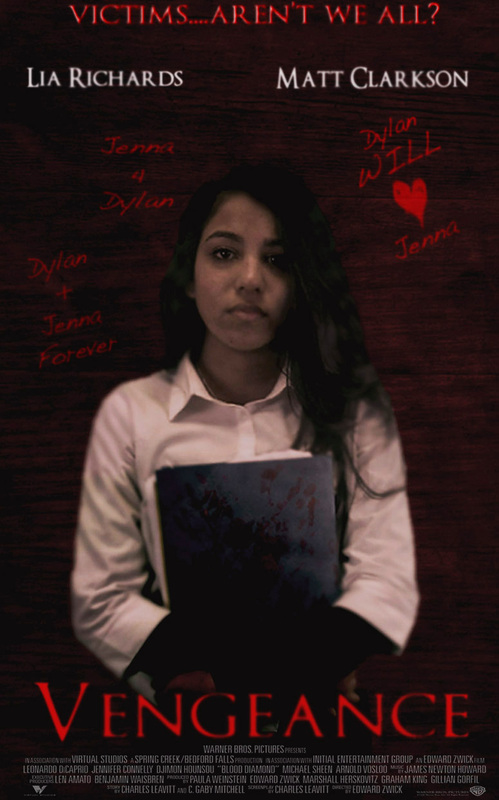
The Hollywood film poster represents women from a negative perspective. The blocking of the female character is centered on the poster, which shows that she is the main character in the movie. The character is seen wearing a smart outfit consisting of a shirt and black trousers. This shows that the character herself is intelligent. She is also seen holding a book and the back of the book which the audience can see, has blood hand prints on them. This tells the audience that she is an evil character as the blood may be one of her victims. The facial expression on her face shows that she is a serious and miserable character. The low key lighting on the film poster helps shows the darkness of her charcter. The background is a red/brown wall with faded scrtch marks on it. On the wall, written in red, there is writing on it, for example, one of the pieces of weiting on it says, "Dylan + Jenna Forever". The pieces of writing shows her obsession with this one person called Dylan. This presents to the audience that the character also has psychological issues. The background and foreground picture have a red tint over it. The red overall in the poster has been used in the poster as it is a typical convention of thriller movies.
For my Film Noir poster, i intended to follow the draft i had made for it. However i did make a few changes to the film poster as I felt it was better than my original idea. I firstly changed the blocking of the characters. In the draft, the characters are standing in front of each other holding hands and the shadow shows the female character aiming a knife at her male partner in front of her. This changed to the Female and male character walking together and the female character is aiming a gun at her male partner who is the anti-hero in the movie. The reason of why I changed the blocking of the characters is because i thought that by the female character being in front of the male character, leading his way, this would show that her character is more dominant. I also changed the background of the poster. In the draft, the characters are in a foggy ally with a lamppost but i changed it to a background of building and a lamppost. The reason of why I changed the background is because I was unable to find or create a background that had the fog and the lamppost.
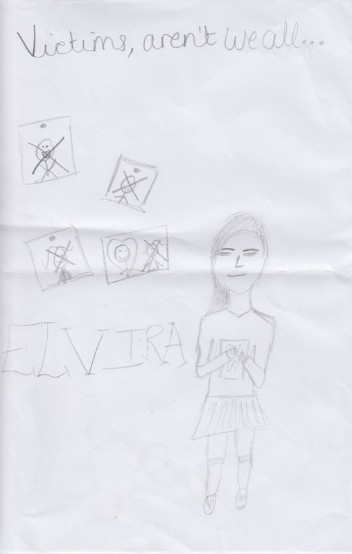
For my Hollywood film poster, I made quite a few changes to the poster from what I had done in the draft. One of the changes i had made was the look of the female character on the poster. In the draft she is seen wearing a jumper with her hair tied up and a smirk on her face. I however changed this to her with her hair out, she is wearing a shirt instead of a jumper and she has a straight face with out a smirk. The reason of why I made this change is because with the hair being tied up, it made her look younger than a teenager and that was not what i wanted to present her age as on the film poster. Also I wanted to make the film be a psychological thriller so by making the character have a straight face, it made her look miserable and more serious. I also changed the name of the movie. For the draft, the name of the movie was "Elvira" which would have been the name of the female character, however i did not like this after i had designed a majority of the poster for the final. So I decided to change the name of the movie to "Vengeance" as it had more of a relevance to the movie and it sounded more catchy.
I think that the finished production of the film noir poster and the Hollywood film poster do look professional. I think this because i have used typical conventions found in both types of movies and have applied them to my film posters. I prefer my Film Noir poster because I like the way that the female character has been presented.
Warner Bros. is one of the oldest Film Institutions in the world and have previously produced various Film Noir movies such as 'Double Indemnity' in 1944. For my Film Noir film opening "Kiss Of A Killer" , for a previous project, I used Warner Bros. As the film institution. I was creating the film poster for "Kiss Of A Killer", so I decided to use Warner Bros. as the institution that would produce the movie of my film poster. My Film Noir movie's target audience were adults ranging at an age group of 20+ years. The reason of why i chose the target audience to be adults of that age range is because it would most likely appeal to them the most rather then for younger age groups. I know that adults would appeal to the stereotypical conventions of a film noir movie such as the mystery of the story and the presentation of a femme fatale character in a film noir movie.
For my Hollywood film poster "Vengeance", I again used Warner Bro's as the institution that would produce the film because Warner Bros. has produced movies in the past of a similar hybrid such as the "Final Destination" film series. The target audience for my Hollywood film was aimed at teenagers/young adults aged 15+. The reason of why I chose the target audience to be teenagers/young adults is because the female leading role is a teenager in high school so the audience would be able to understand and relate to the character in the movie. Also the film is a hybrid movie so as well as the genre being a thriller, it is also a romance movie and I know that this would appeal to female teenagers also.
Femme fatale characters were populated in film noir movies and this helped for the research for my film noir poster. I knew that the film noir poster had to relate to my film opening "Kiss Of A Killer" therefore I looked at noir movies of a similar storyline such as "Double Indemnity". By watching the movie and analysing the characteristics of the femme fatale character, I was able to use research from the movie to apply it to my film poster. Using typical conventions of a film noir movie such as back-streets and shadows, I was able to draft a film poster which suited the story line for my film opening.
For the Hollywood film poster, the research was much more difficult to do as I had to narrow down the sort of female character I wanted to present on my film poster and which genre the film would be. After looking at various movie posters which had a female leading role, I decided to choose a film of a thriller genre with a female teenager as the leading role. To make the film poster a hybrid I decided to add romance into the story. It was easy to put the female character in a situation that would involve romance and a situation that would match the thriller genre. Using conventions of a thriller story such as low light settings and blood, i was able to draft a Hollywood film poster.
My film noir poster's representation of women was evil. The blocking of the female character was very dominant to show that she was the stronger character. By putting her in front of the 'anti-hero' in the movie, it showed how her character was taking the lead of her relationship with the character but also showed that he would lead the movie. It was also her shadow on the ground which showed that her character was evil as it was pointing a gun at the male character (anti-hero); the aim of the shadow was to show the audience that her character was a backstabber and was an evil character as these were typical characteristics of a femme fatale character. The colours used for the poster were mainly black, white and red. The black and white is used as that is what the colour of film noir movies were. The red however was used as a representation of blood. The male character on the poster is seen wearing a trench coat and fedora hat. These were typical costume items that an antihero in a film noir movie, is seen wearing. The female character is seen wearing a belted coat with rich red lips. The colour of the lips is not prominent in the picture however, the intensity of the lipstick helps bring the typical femme fatale make-up together.
The Hollywood film poster represents women from a negative perspective. The blocking of the female character is centered on the poster, which shows that she is the main character in the movie. The character is seen wearing a smart outfit consisting of a shirt and black trousers. This shows that the character herself is intelligent. She is also seen holding a book and the back of the book which the audience can see, has blood hand prints on them. This tells the audience that she is an evil character as the blood may be one of her victims. The facial expression on her face shows that she is a serious and miserable character. The low key lighting on the film poster helps shows the darkness of her charcter. The background is a red/brown wall with faded scrtch marks on it. On the wall, written in red, there is writing on it, for example, one of the pieces of weiting on it says, "Dylan + Jenna Forever". The pieces of writing shows her obsession with this one person called Dylan. This presents to the audience that the character also has psychological issues. The background and foreground picture have a red tint over it. The red overall in the poster has been used in the poster as it is a typical convention of thriller movies.
For my Film Noir poster, i intended to follow the draft i had made for it. However i did make a few changes to the film poster as I felt it was better than my original idea. I firstly changed the blocking of the characters. In the draft, the characters are standing in front of each other holding hands and the shadow shows the female character aiming a knife at her male partner in front of her. This changed to the Female and male character walking together and the female character is aiming a gun at her male partner who is the anti-hero in the movie. The reason of why I changed the blocking of the characters is because i thought that by the female character being in front of the male character, leading his way, this would show that her character is more dominant. I also changed the background of the poster. In the draft, the characters are in a foggy ally with a lamppost but i changed it to a background of building and a lamppost. The reason of why I changed the background is because I was unable to find or create a background that had the fog and the lamppost.
For my Hollywood film poster, I made quite a few changes to the poster from what I had done in the draft. One of the changes i had made was the look of the female character on the poster. In the draft she is seen wearing a jumper with her hair tied up and a smirk on her face. I however changed this to her with her hair out, she is wearing a shirt instead of a jumper and she has a straight face with out a smirk. The reason of why I made this change is because with the hair being tied up, it made her look younger than a teenager and that was not what i wanted to present her age as on the film poster. Also I wanted to make the film be a psychological thriller so by making the character have a straight face, it made her look miserable and more serious. I also changed the name of the movie. For the draft, the name of the movie was "Elvira" which would have been the name of the female character, however i did not like this after i had designed a majority of the poster for the final. So I decided to change the name of the movie to "Vengeance" as it had more of a relevance to the movie and it sounded more catchy.
I think that the finished production of the film noir poster and the Hollywood film poster do look professional. I think this because i have used typical conventions found in both types of movies and have applied them to my film posters. I prefer my Film Noir poster because I like the way that the female character has been presented.
